PROCESS
I first read an assignment and looked at the supporting visual materials provided. Then I started to research the local newspapers for their specifications; I couldn't find any specs online for Palo Alto Weekly or Palo Alto Daily News, so I emailed them with the request to provide the specs.
I did find the detailed information for the SF Chronicle, so I decided I would create an ad based on their specifications. First, they don't have an advertising space for 5x7 or 7x5 placement, so I decided I will work with one of their standard sizes for a broadsheet: 4.792x6.33 and later convert and create a second version to be 5x7 as requested.
I then went back to the content provided and read and re-read it again, thinking how I can group the related parts and visually distinguish the different ones. I also always look for a way to shorten the text and I am not worried about trying to rewrite it at this stage of a creative process. I see design as a highly collaborative process and look for feedback right after the initial draft.
I looked at the images again and realized that even though the main message of the ad is about a broader community outside Stanford, mostly of the images provided highlight the Stanford students. I wanted to explore what else is available that would showcase the community. I went to Stanford Live, Googled Stanford Family Events, went to the Cantor museum website and Sallie catalog.
I ended up using two images from the provided stack, and two from other resources - one illustrating the community classes (dancing) and the other to show the family time. Given the time constraints, I couldn't find any good imagery to show the classroom learning (such as Stanford Continuing Studies classes).
I knew from the beginning that I want to work on a color, not black and white, ad - most of the newspapers can handle them, and the Cardinal color is a highly recognized branding attribute.
I created a blank InDesign file, pulled the images and the raw text in. Newspaper ads have a lot of design limitations due to the quality of the paper, the amount of ink the paper absorbs, print process, and CMYK color space. Those limitations include the percentage of the white and black points, spot colors and gradients usage, and even the font size (for example, no less than 12 pt for the reversed type). So, as a designer, I need to be careful and work within those limitations.
DRAFT 1
I quickly put things together - I wanted to use the shapes that would illustrate the dynamic environment of Stanford, and rounded shapes or swooshes usually suggest the movement and dynamic flow.
I printed a draft and realized that I have a few problems. First, the black text didn't look good on the Cardinal color background. Second, I needed to highlight the main point of the ad - the neighbors.stanford.edu website and newsletter subscription and I felt I didn't have it here. So, I scribbled to see what I can move around to get a message across better.
DRAFT 2
After the rearranging the content, I went on to work on the images, which all had to be converted to CMYK (I used CMYK Newsprint color space), 240 dpi (per SF Chronicle). The image of a father with a toddler was a jpg file taken from a website, so the skin color was too saturated and if printed, would be too red. Even though I toned done the vibrance, ideally, I would request a raw format image to work with. Also, because of jpg compression, it appears pixelated. If the original can not be found, I would look for another picture.
I did a standard image retouch and sharpening, and again, I would request the original source files, not jpgs, for all of them.
(Since the colors are converted to sRGB for online display and compressed for jpg even further, here you won't be able to see the accurate colors for print).
I was still unsure if this ad was getting the message across. It looked to me as just an advertisement for the website, whereas I wanted to emphasize the 'community' part of the message. So I changed the main key words and thought that it looked better.
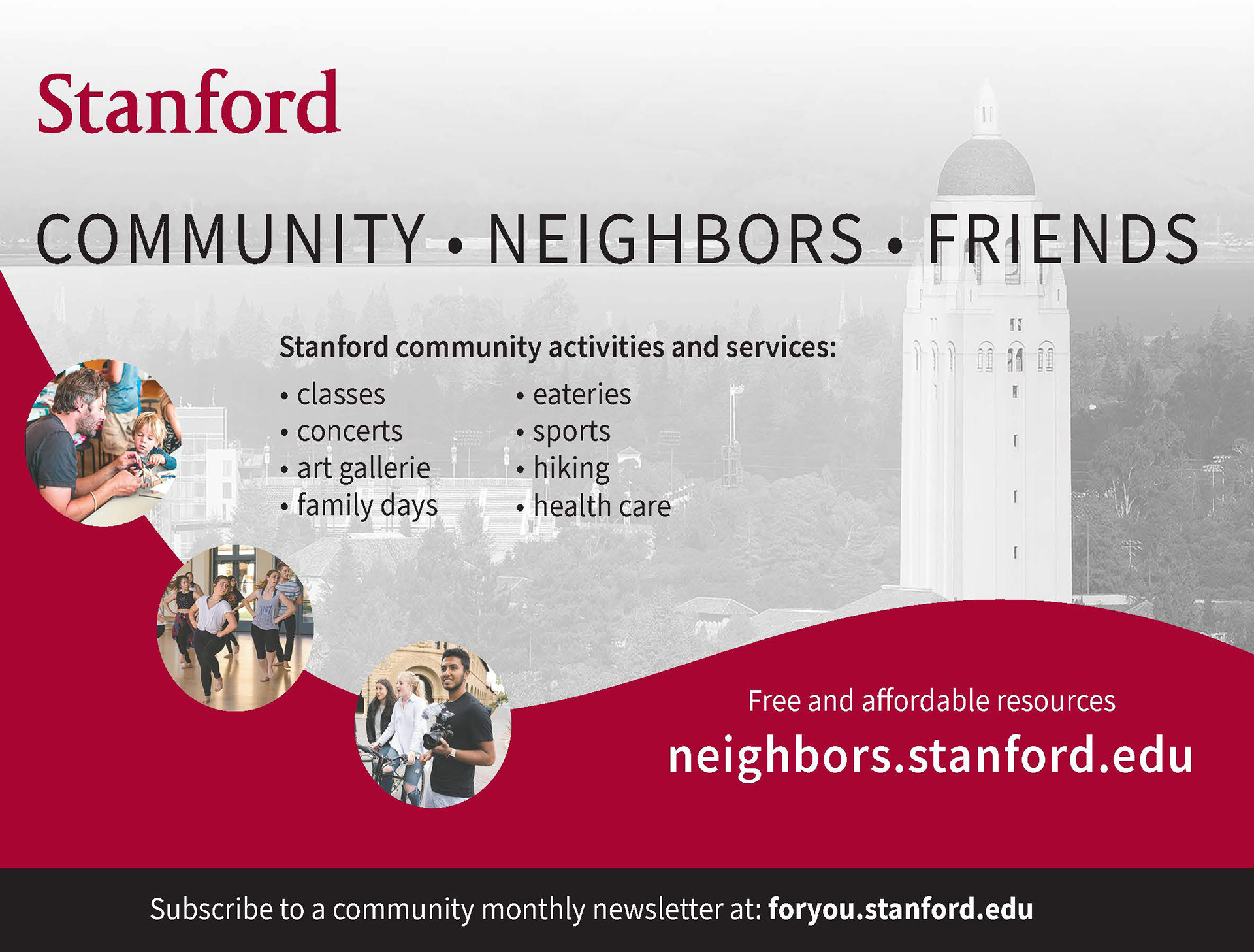
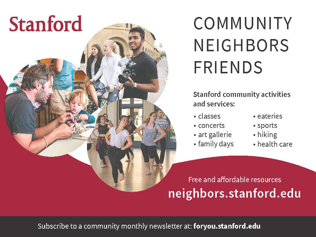
It still looked a bit busy for me, and I wanted to create at least 3 designs that I could present. So, I went to a yoga class to take a break... When I came back, I thought it definitely looked busy for my taste, and I wanted to make something that would be easier to parse yet would still retain the fluidity and look dynamic. I then created these two: one that highlights the iconic image of the Stanford grounds - the Hoover tower, and the other that emphasizes the community and people aspect of the message with bigger images.


Some newspapers ('San Francisco Chronicle' is one of them) require a printed accurate color proof submitted with an electronic file which is needed to be printed separately (TBD where).
At the end, I created the final press-ready pdfs - ones converted to the US Newspaper color space, where the colors are shifted to meet the constraints, and the others with the colors preserved numbers (which can be tested in Acrobat in the Flight preview).